Since 2015 I've been managing the UX team for Google Translate, a product that touches 1 in 6 people's lives on the planet every month. My family and friends sometimes ask: what's there to design for Google Translate? Here's the answer.
Foundation
Google Translate is a family of products that include mobile apps (iOS & Android), a web application, a crowdsourcing community, as well as multiple integrations in other Google properties like Search, Chrome, Gmail, Docs, etc. I joined the team in 2015 with a mandate to improve our products for our diverse global users, and to create a vision for translation experiences of the future.
Compared to my previous team at Google, Translate was a lot smaller and more scrappy. In the beginning, I was the only UX designer in the team, and this startup-like culture was something I greatly valued. I also valued staying organized. Establishing simple things like a centralized file system, internal team website, weekly email updates, quarterly objectives and a project allocation process not only made UX contributions more visible and collaborative, but also created a strong foundation that scaled well as my team got bigger.
Compared to my previous team at Google, Translate was a lot smaller and more scrappy. In the beginning, I was the only UX designer in the team, and this startup-like culture was something I greatly valued. I also valued staying organized. Establishing simple things like a centralized file system, internal team website, weekly email updates, quarterly objectives and a project allocation process not only made UX contributions more visible and collaborative, but also created a strong foundation that scaled well as my team got bigger.
Focus on user research
More than a billion people around the world use Google Translate. From language learning to communication, they have a diverse set of needs. In addition to being an efficient utility app, we wanted to better understand our users' current workflows and pain points to provide better experiences for the most important use cases. For this, we needed to do user research, but in the beginning we didn't have a user researcher on the team, so I had to do it myself.
After digging through past studies and organizing it in a research archive, I created a UX research program focused on international markets where Google Translate had a large and growing user base. The program offered a variety of research methods; Google Surveys allowed us to ask anything from our users in a few clicks, in-house cafe studies helped us settle minor UI questions quickly, vendor-driven usability studies gave us deeper insights internationally, and annual immersive discovery trips gave us valuable first-hand knowledge of our users globally. Using this program we conducted more user research studies in my first year at Google Translate than in all the 5 previous years combined.
Improving consistency
Over time and with different people having worked on our different platforms, inconsistencies had crept in. I made consistency a central part of our philosophy by requiring that all new features be conceived of and designed with all of our different platforms in mind. To help establish visual consistency across our products, I also created a brand style guide and published it on our central spec website and hired the talented Alex Mostov to create our illustrations.
Creating a vision
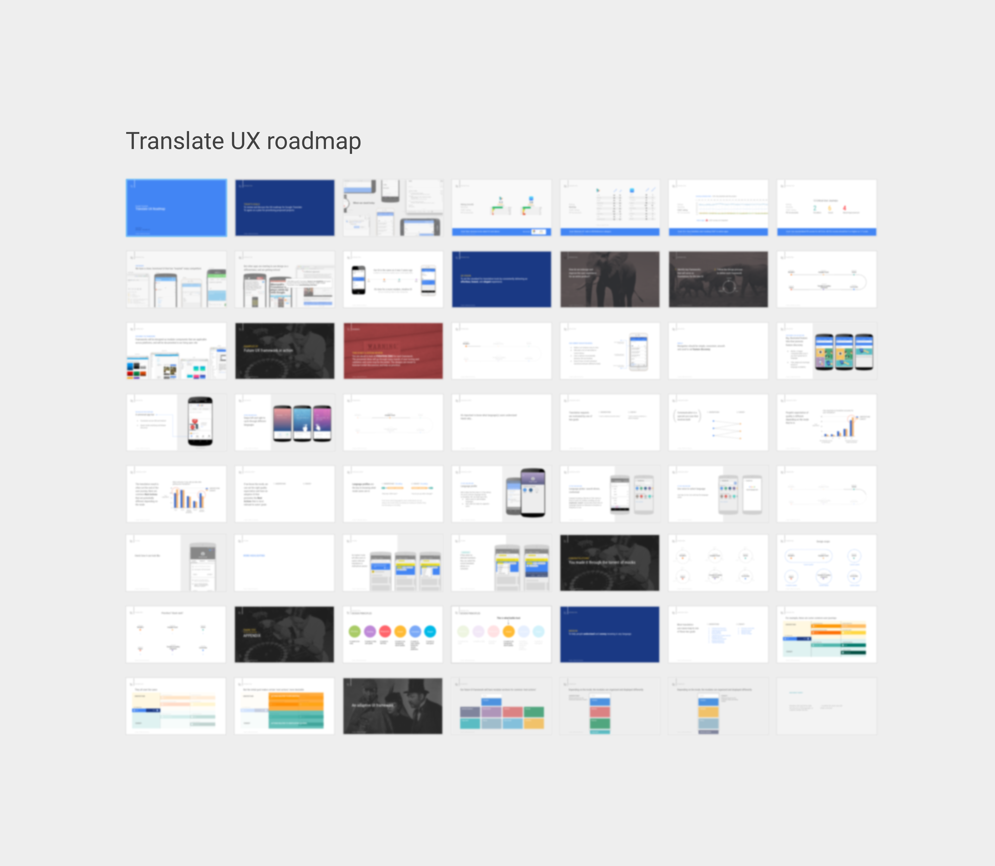
We had a great process and we were doing good research. What was missing was a vision. I volunteered to plan and run our team's annual strategy off-site, and used Design Sprint methods to structure the day around vision-setting activities. After the sprint, I used all the ideas we generated to create a draft product vision and roadmap, focusing on 5 key areas, and presented it to our leadership. They were excited and supportive. That roadmap is still used as a basis for project planning and prioritization.
Intentionally blurred due to confidential material
Case study: Tap to Translate
One of our key research discoveries was this: eager to consume content in their local language, users in countries like Brazil and India were creating their own “hacks” by copy-pasting to and from Google Translate, to translate content shared within messaging or social apps. Given that more than 50% of content on the web is in English, and only 20% of the world’s population has knowledge of English, this makes a lot of sense.
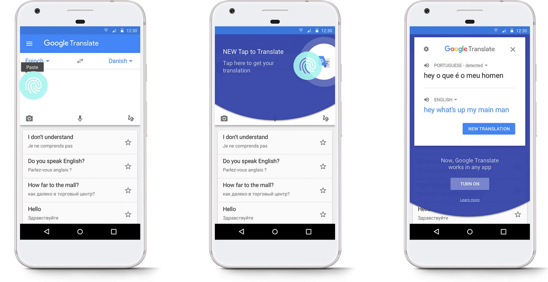
Having to switch back and forth between Google Translate and other apps was a huge pain point. To solve this, we joined forces with Google's amazingly talented Creative Labs team who came up with the idea of Tap to Translate: a feature that allowed users to instantly translate any text from within any app on Android, simply by copying it. This video explains how it works:
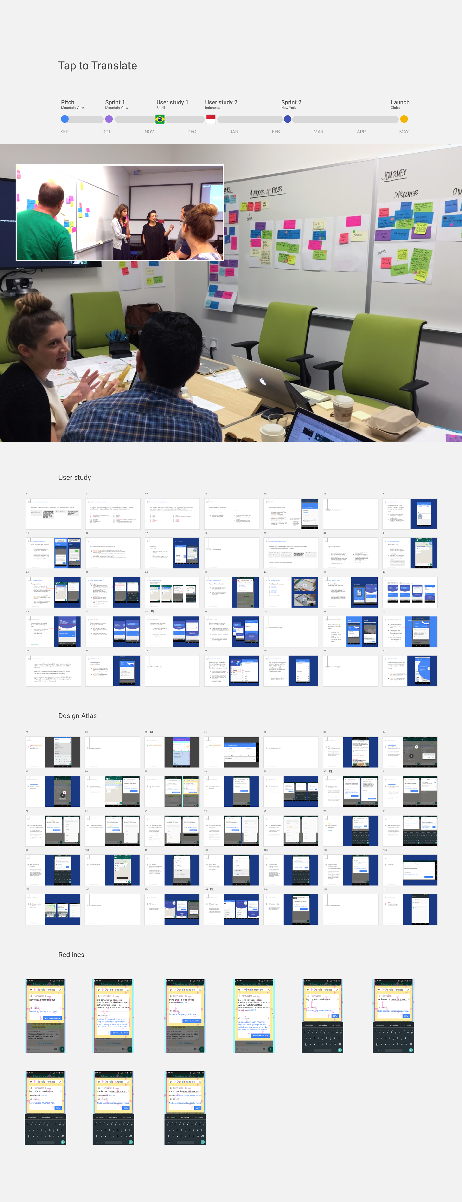
This was not only a huge hit with our users, but also a successful model of cross-team collaboration within Google. As Translate's UX lead, I ran design sprints between our Mountain View team and the Creative Lab in New York, led weekly UX reviews, planned and directed international user research, and iterated on final versions of the design.
BIG LITTLE DETAIL: CONTEXTUAL FEATURE PROMOTION
People use the copy button for many reasons, and we didn't want to annoy them by popping up a translation every time they copied something. So we decided to turn Tap to Translate off by default, and let people who need it the most turn it on themselves. But that introduces the problem of discoverability; what if people who really need this feature don't notice it? I suggested we expose the feature when people need it the most; right after copying a piece of text inside the app. This contextual feature promotion completely outperformed our static promo card on the home screen and is how most Google Translate users discover Tap to Translate.
Case study: offline translations
One of the most useful things about Google Translate is that it works offline and without an internet connection, if the language files are downloaded. The problem is many people didn't know they could download languages. I wanted to fix this.
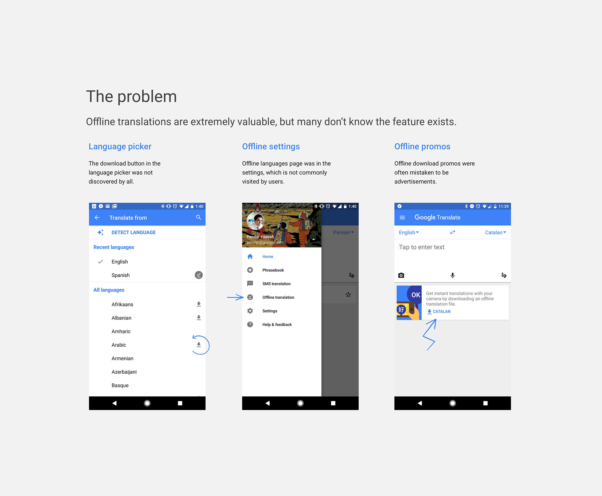
I wanted to find the right way to tell people about our offline feature. An on-boarding tutorial was one of the ideas. We tested a 2-step on-boarding flow that asked users to select their languages, and let them choose additional options like offline translations or Tap to Translate. As expected, most people didn't read the options and didn't like going through on-boarding overall, but every single person did select their languages.
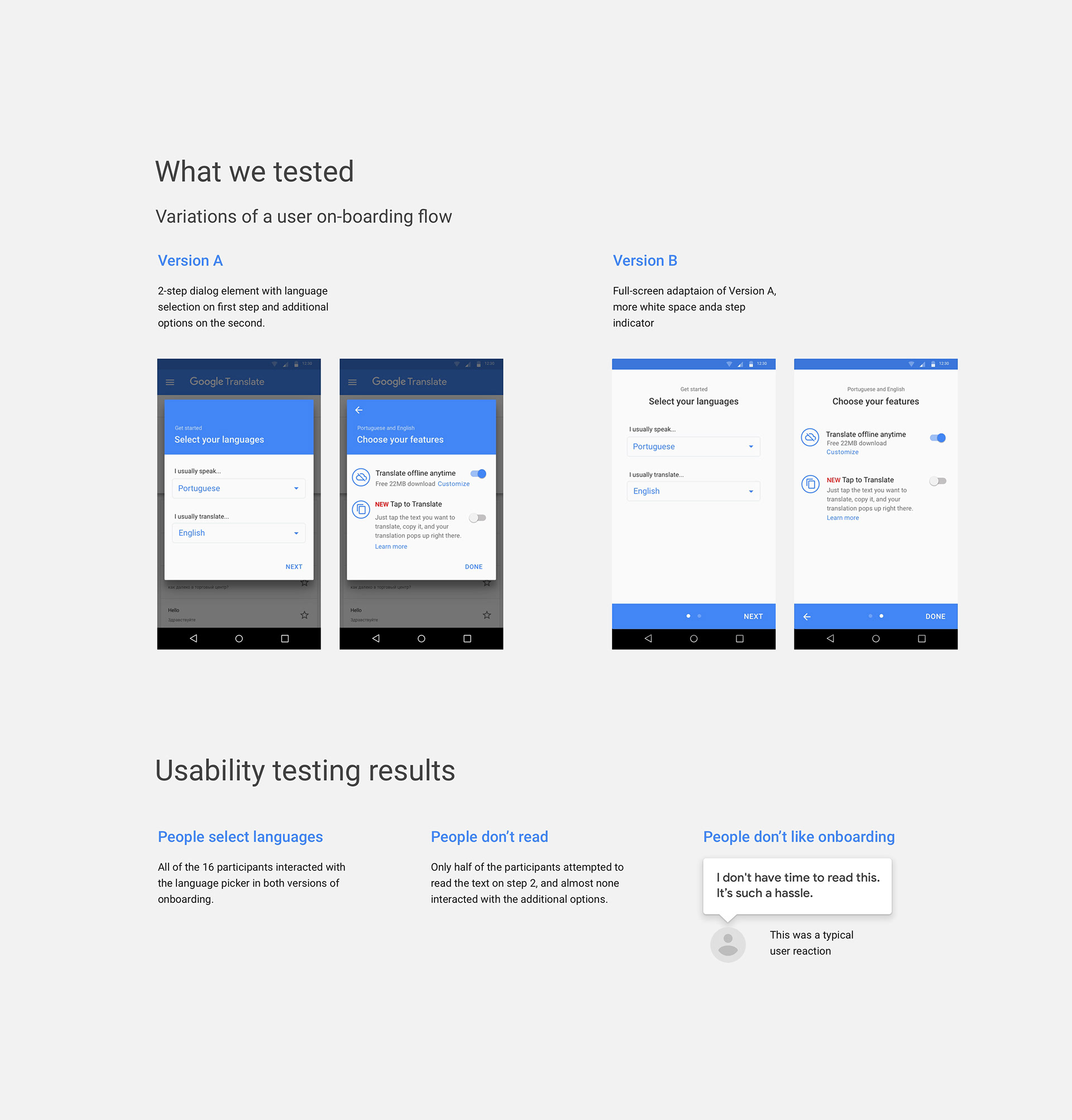
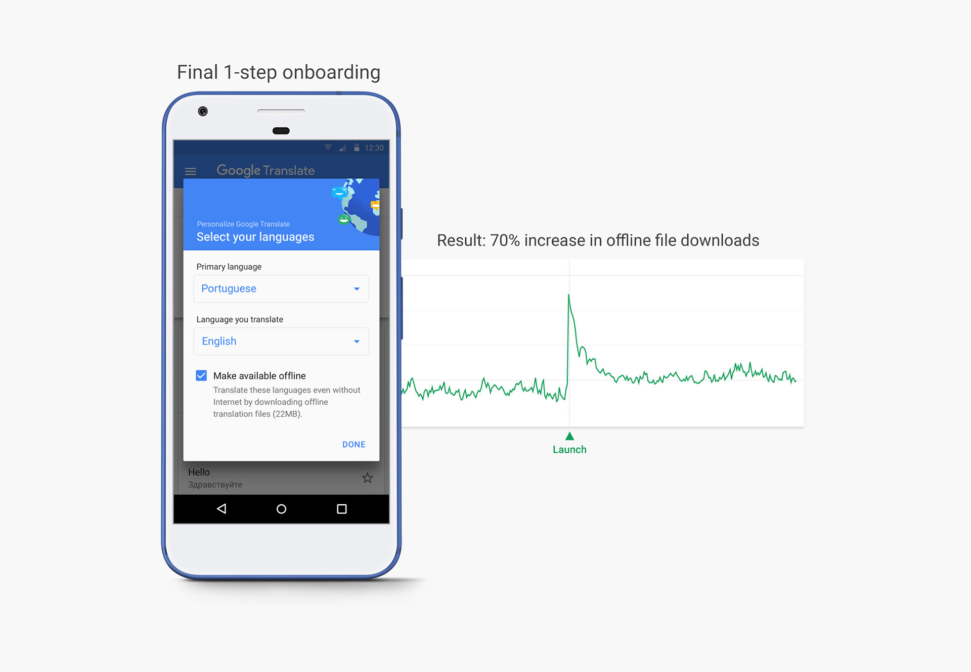
The observation that every study participant actually selected their language –even when they ignored everything else– was an important insight. Based on that, I created a simpler 1-step on-boarding flow with just these elements: language pair selection controls and a checkbox for enabling 'offline translations.' I expected most people to select their languages and immediately hit 'done,' ignoring everything else. Since the offline translation checkbox was selected by default, that meant that most people would end up downloading the right offline translation files, even if they didn't pay attention to it. For these users, Google Translate would "just work" offline. After launching this, we saw a 70% increase in offline translation usage.
Scaling the team
Despite having a multitude of surfaces to support, Google Translate had for many years only a single UX designer. It was obvious to me when I joined that we needed more resources, but getting it in a technology and research-first organization was going to be an uphill climb. In less than three years I grew the UX team by 5x. Here are some of the strategies I used:
Show, don't tell: I had already proven the value of UX through successful design-led launches like Offline Translations and Tap to Translate. Using the internal networks I had built through launching Google's Dribbble presence and internal UX resources, I put volunteer designers on small projects to demonstrate how additional resources could lead to even more impact.
Active interviewing: my first full time hire came by as a result of my participation in interview panels and hiring committees at Google. I happened to interview an extremely strong candidate (for a different role) who was also passionate about our product. When I submitted the headcount request along with the candidate's impressive interview feedback, it was hard for our VP to say no.
Turning failure into opportunity: there was one particular project that did not go as smoothly as planned. I argued that our problems could have been avoided if we had done better UX research. This is how we got our first full-time researcher.
Rotation programs: I used available rotation programs at Google to hire additional talented designers. This strategy yielded great results not only for us, but for the designers who got a real chance to grow in their careers by taking meaningful ownership of projects on an important product like Google Translate. Our first rotational designer was one of a handful of people in her program to get promoted after her rotation.
More to come
At Google Translate we are always looking for ways to improve our products for users and find new and innovative ways to break language barriers. We have some exciting projects in the works. I'll continue to update this case study as those projects continue their journey. Until then, thanks for reading :)